I had originally decided to design the Critical Thinking Cap course with the concept of microlearning in mind. I made that decision based on my enjoyment and engagement with two apps/courses: Noom and Duolingo.
The original idea: microlearning
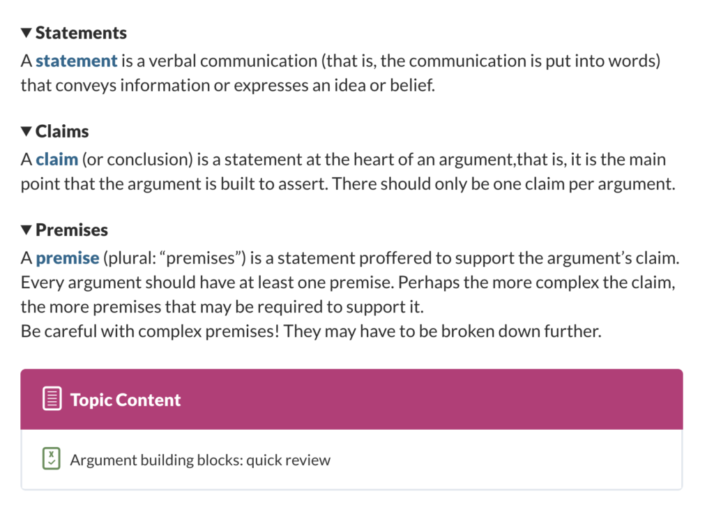
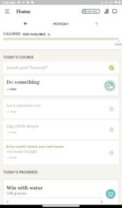
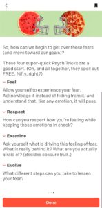
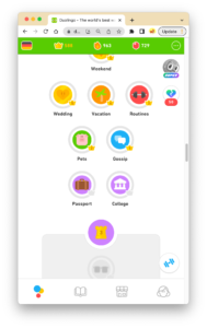
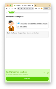
The screenshots below demonstrate the simple and uncluttered visual design of each learning experience, both for lesson listings and individual lessons or exercises (first two are from Noom; second two from Duolingo):
Upon review of the course content I’ve structured and added so far, I’m realizing I’m falling short of the “simple and uncluttered” ideal.
Content crisis
For one thing, I think I’m curating too many instructional-content videos, that is, instead of working out the verbiage of the lesson content, I’ve been leaving it to videos other people have already authored and produced (read: did the hard work for). I don’t think that’s working out so well. First of all, the videos I’ve selected so far, though well-produced and informative, look and sound very different from each other, so my lessons seem more scattered and less cohesive. Second, the video content doesn’t perfectly fit my course outline, in some cases material is presented in a different order than I had planned.
Thirdly, another criterion I had for this course was to provide transcripts of any video content, to serve people who cannot listen to the video for any reason. Too many videos will make that criterion harder to comply to, and quite cumbersome. Also, I hate relying on YouTube to supply key course content. What if the videos are pulled from YouTube? I’d have huge gaps in my lessons.
Long story short, I was taking the easy way out: Hoping I could curate enough multimedia so I wouldn’t have to write all the lesson content myself.
I’m reconsidering. I want to try to focus more on cohesive content that I write myself vs. a hodgepodge of materials from outside sources. I will still use videos to demonstrate concepts, give examples, offer alternative viewpoints, etc. — but not to replace actual lesson content.
Structure simplification
The default LearnDash navigation is quite chunky and pervasive – navigation buttons abound before and after each unit – be it a topic, subtopic, etc. Below, at the end of a subtopic, the user sees:
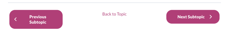
A tad confusing, no?
I’m scrapping the idea of using subtopics — why complicate the structure with further levels if I don’t have to? Instead, I’ll look into using a disclosure / collapsible section structure where the user can show/hide additional content without having to click back and forth. (Illustrated above in the second Noom shot for the terms “Feel,” “Respect,” etc.) This wouldn’t be a LearnDash thing — it’s something I should be able to add or code within the WordPress editor, hopefully without resorting to another plug-in. (Fingers crossed . . .)
Edit: Well, using the <details> element went well: