The initial Critical Thinking Cap course offering — for Capstone purposes — was to provide one relatively small lesson that anybody could take whether they were registered with the site or not, plus one meatier lesson for which a user would have to be registered before enrolling. Both of these lessons would be linear, that is, a user would have to complete one topic before continuing on to the next. If a user is registered, the system will keep track of progress within each course. I don’t think there is progress tracking for the first lesson if the user isn’t registered.
I’m still planning on these two lessons BUT the second “meatier” one will be less meaty, that is, it will have fewer topics than originally planned for the course launch.
In place of the the extra meat for that second lesson, I’m adding another lesson that will require no registration. This “How to take this course” lesson will be the first lesson of the course. Unlike the other two lessons, this course will demonstrate a “free form” course in which the user can explore topics in any order they please.
I had a beastly time getting the featured image of the lesson to look sharp in its lesson card. The original EPS image came from the same source as all the other images I’ve used so far, and I’m pretty sure I went through the same steps to recolor the illustration then save it as a web image. The image looked lovely on the actual lesson page, but in its lesson card, it was frightfully blurry:
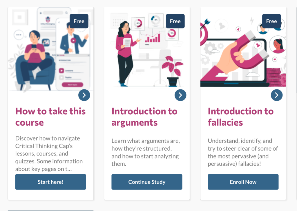
To solve this problem, or at least slap a band-aid on it, I installed a plug-in that allowed me to use SVG images (by default, WordPress does not allow SVG images). When I used the SVG image as the featured image, the image on the lesson card was nicely sharp. Alas, now it was sharper than the other lesson-card images, so I did some tweaking to those. Latest result:
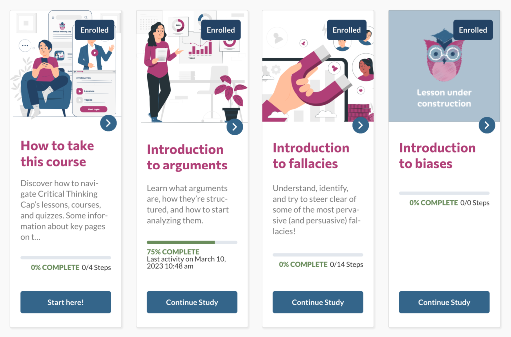
As a “nice to do” task, I could see if I can move that “Enrolled” ribbon up or down so it’s not covering key portions of the featured images, you know, like somebody’s head. But that’s a very very very minor concern right now.