The default stylings of LearnDash quizzes — especially quiz feedback — is abysmal. The most egregious aspect of the styling, in my view, is the between-paragraph or between-element vertical spacing.
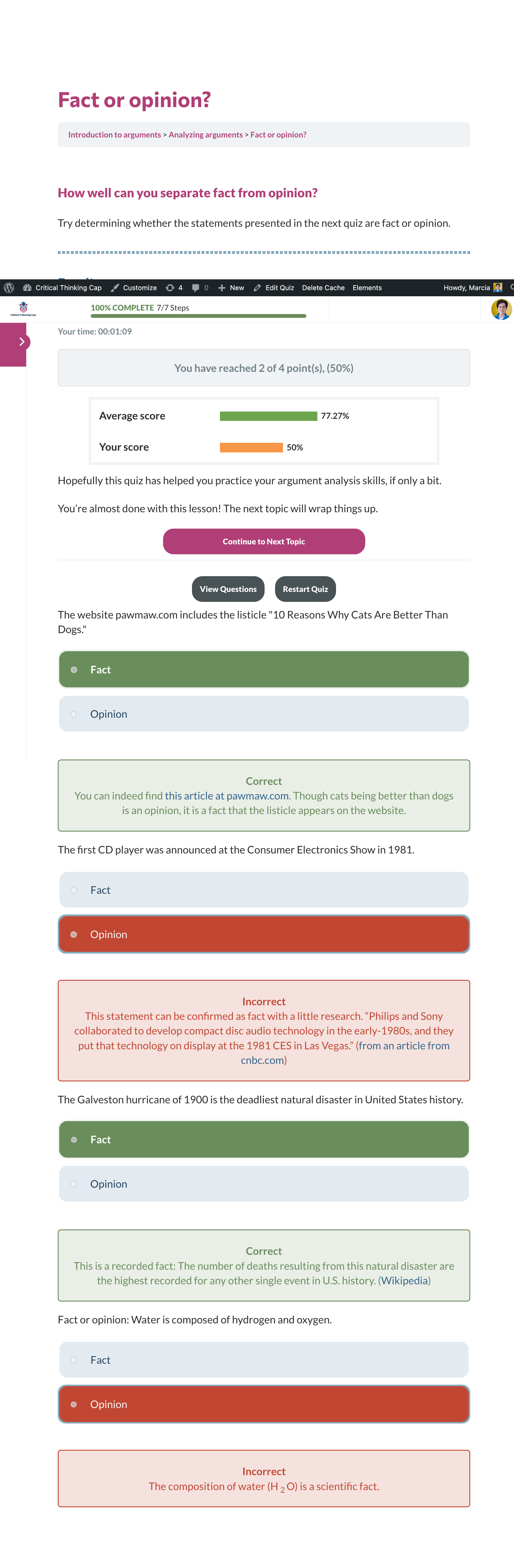
As an example, the screenshot below shows the the default styling (other than the colors I’ve already updated) when the user selects the “View Questions” button on the screen that comes up after he or she completes a quiz. The spacing between lines and elements is all wrong; spacing between elements related to each question can be larger than the spacing between the sets of elements for each question. (Not finding the right words to describe it right now!
Let the adjustments begin! And I’ll try to get rid of those useless radio buttons while I’m at it.
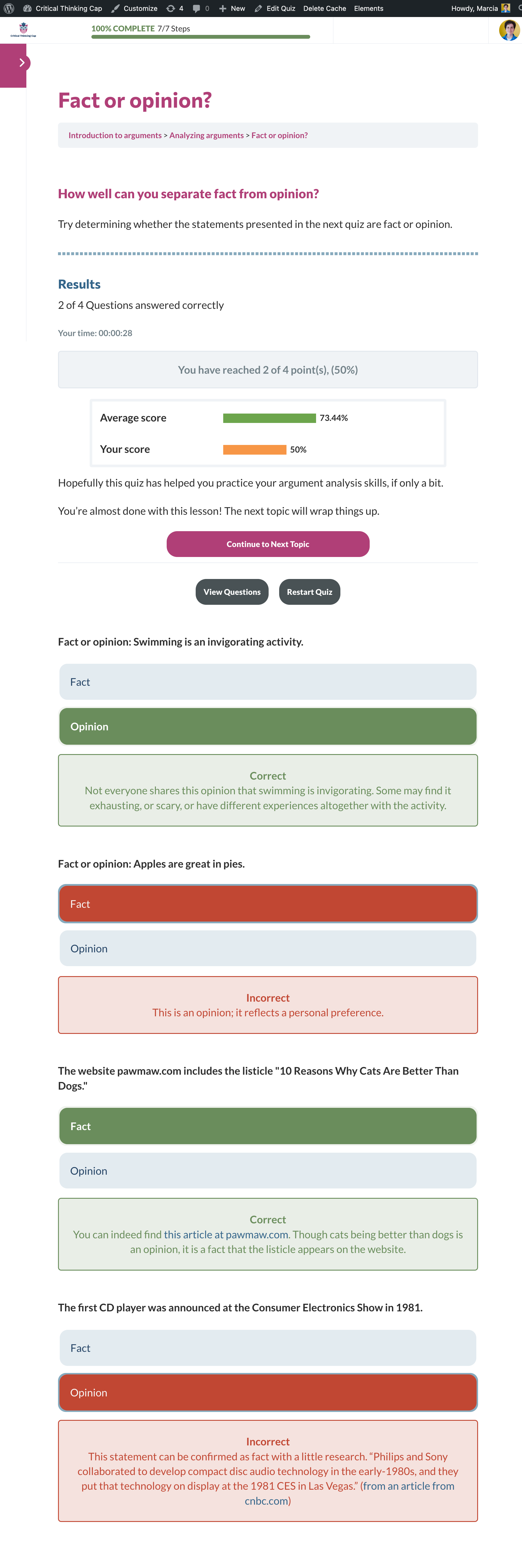
Results below. Still have some tweaking to do; but things are looking much better overall:
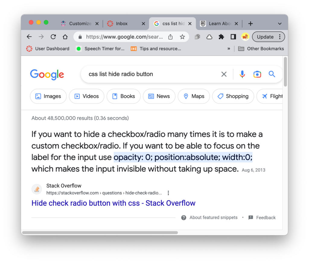
One last thing: Many thanks to the well-targeted Google result that helped me oh-so-easily get rid of those darned radio buttons. (If there is a reason to include the buttons for screen readers and such, it’s actually still there, just hidden and the space it takes up removed.)