With only a few more days until Capstone deadline, most of my fine-tuning is focused on quizzes.
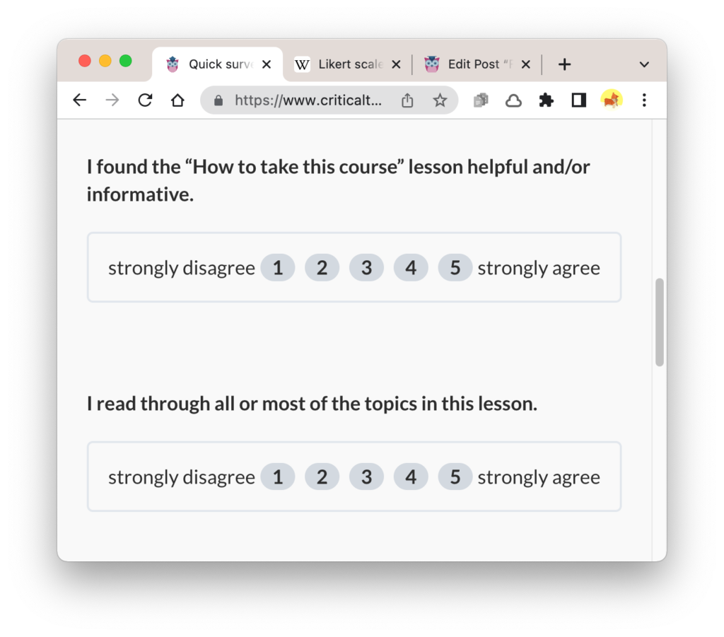
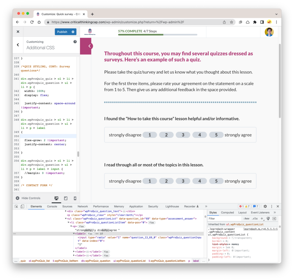
My latest obsession: fixing the formatting (spacing, mostly) within the quiz questions that take the form of a survey, specifically a Likert scale:
It was driving me mad that the backgrounds of the numbered selections were so narrow and that the border extended far beyond the width of the text. Either I had to make the border adjust to the contents or spread the contents out within the apparently fixed-width border.
A quick inspection of the HTML/CSS led me to a sad reality: I would have to re-learn CSS Flexbox, or at least relevant parts of it, to get this done. (The use of Flexbox is signalled by all the little “Flex” indicators in the HTML.)
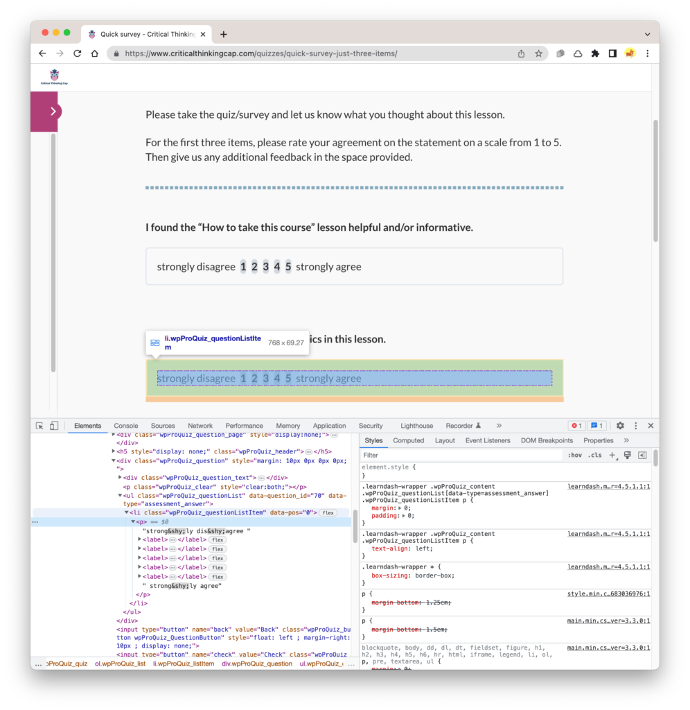
After an hour or so of futzing, shots in the dark, and trial and error, I learned that: 1) That <p> element containing the <label> elements needed to become a flex container, its width set to 100% of its parent container, and it’s “justify-content” set to “space-around”. 2) Each <label> needed to be set to “flex-grow: 2” so they could grow equally within the <p> as necessary. (Admittedly, I’m not sure if “flex-grow: 1” would have also worked.)
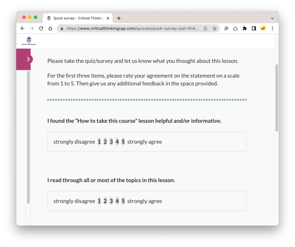
Those adjustments got me rather far, I think:
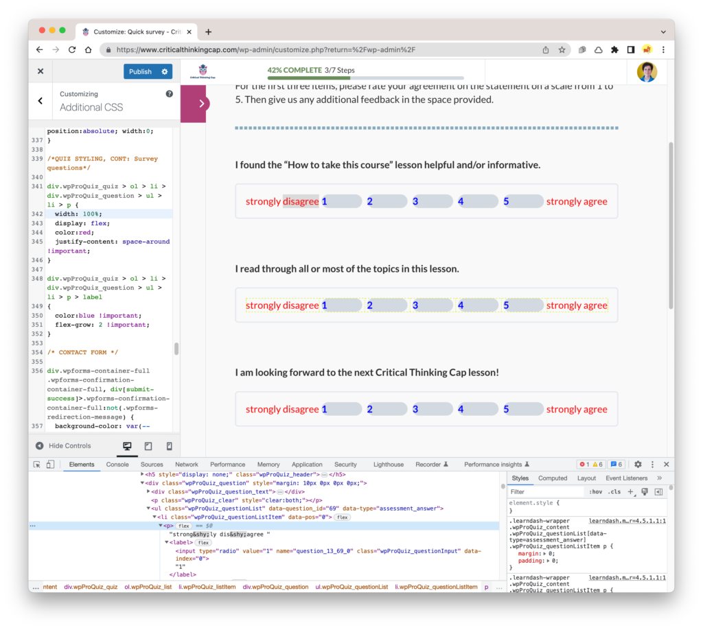
Last item to take care of: Centering the numbers within their little areas. Is this an alignment, margin, or padding issue, or some assortment thereof? Apparently it was an alignment issue, as adding “justify-content: center” to the <label> element seems to have corrected things.
And so, in the end we have:
And this solution seems to respond well to resizing. I shall now move on to other quiz-related issues.