It has been said that you may not find problems with your project until you try to describe or explain your project or parts thereof to somebody else.
This has certainly been the case as I started to zero in on the “How to take this course” lesson, which is basically a user guide dressed as a lesson.
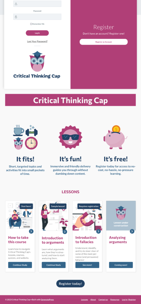
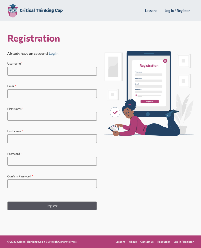
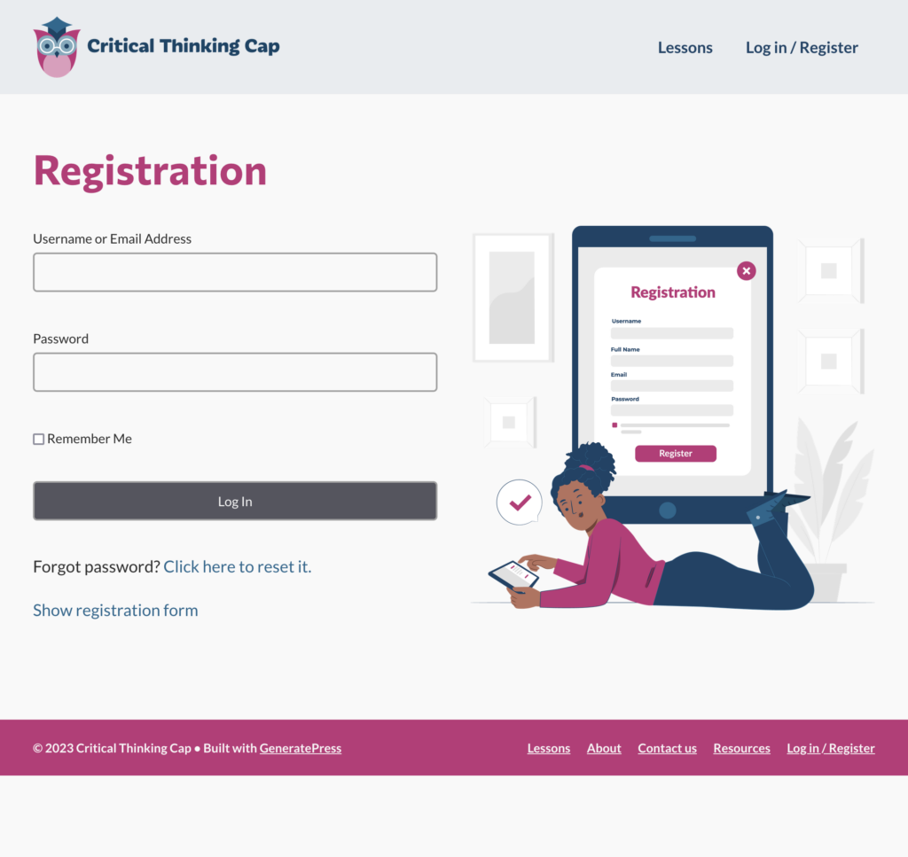
When I started the first topic of this lesson, “Course registration,” I had difficulty explaining that there was a registration form via a registration page that you would access by selecting “Register today!” buttons on the front page, but that you’d get a different form if you selected “Log in / Register” links in either the footer or the header. The version of the homepage (with the links in the header and footer) is below, before and after a user selects a “Log in / Register” link that triggers the log-in pop-up. (Another annoying but less important problem is that sometimes the “Login” headline of the form is cut off, depending on the dimensions of the browser window).

To complicate things further, on the registration page proper, you could sorta toggle back and forth between a registration form and a log-in form. Alas, though the form changes from a registration form to a simple log-in form, the heading stays the same. (I should note here that the registration forms I’m using and all the functionality within them are generated by the LearnDash plug-in; I cannot edit links and verbiage therein without altering plug-in or theme files, which I’m loath to do at this time.)
The temporary (?) solution
My solution (read: band-aid) is in two parts:
- Disassociate the the log-in pop-up form from the registration page
- Adjust some of the verbiage on the registration page to cover both scenarios (registration form or log-in form):
- Change the header to “Welcome (back) to Critical Thinking Cap!”
- Add brief introductory verbiage: “Need to register or log in? You’re on the right page!”
I looked at a few other sites that offer courses (a task made easy by this post from The Muse); most had separate links or buttons for log-in and registration, so keeping those forms/actions separate seems to be a popular course of action. I also noticed that these sites DID NOT bother to add these links to their footers, so I decided to follow suit.
So, below are the registration page views showing the new header and footer menus for logged-out users. Logged-in users will also get a “Profile” link in the header.

<sigh>Another day, another band-aid.</sigh>