As the countdown to deadline approaches single-digit numbers, I want to settle items on the homepage so I can move on to other enhancements within the site and the lessons.
Here’s a list of homepage issues and how I handled them. Before and after screenshots are at the bottom of this post.
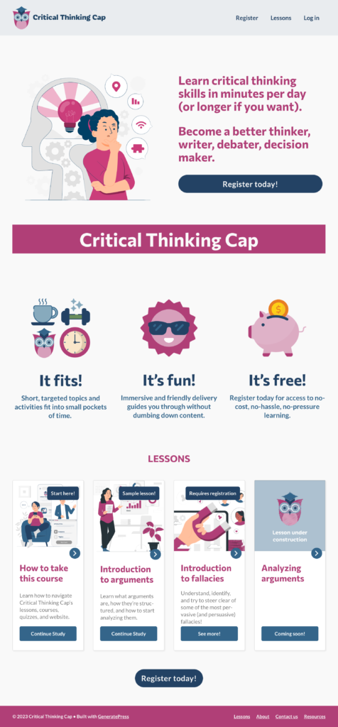
- Colors in main image are slightly off. In Adobe Illustrator, exported original vector image in a different way. (Originally used “Save for web (legacy), better apparently to simply export as PNG.)
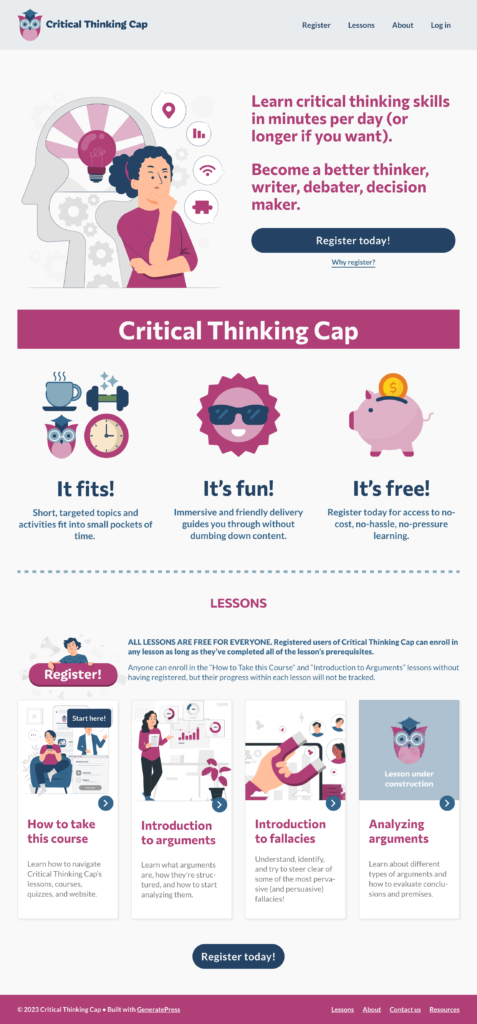
- Test-user feedback: It’s not clear that a user did not necessarily have to register to the site to take the first two lessons. Added some explanation via a “Why Register” link under the first Register button, and added brief details about registration above the lesson grid lower on the page. Also reiterated that all lessons are free, since some testers had mentioned they did not notice that tidbit.
- Test-user feedback: It wasn’t clear what the difference between registering and not registering was. Almost the same as previous bullet point — just adding the subtle point that if you’re not registered, your progress cannot be tracked. (In the future I should also point out that where there is not progress tracking, there is also no certificates or other rewards or incentives.)
- Adding a wide row of text for this new information was too . . . blah. Added an appropriate illustration to the left of this verbiage. Originally the illustration said “subscribe,” so I changed it to “register.” Also made it a button that links to the Registration page.
- Lesson cards: Verbiage on buttons (bottom bars) not really helping either, also hard to control – and varies by whether user is registered or not, finished the lesson, etc. I won’t get into the nitty gritty here; suffice it to say that the best and easiest solution was to just not use the buttons. There are so many other spots on the card that are clickable and that link to that lesson’s page.
- Lesson cards: Verbiage on ribbons (top bars) not really helping, also hard to control through the add-on tool. As with the buttons, the best solution might have been to just not use any ribbons, but I really did want to have one that said “Start here!.” If only using the onscreen controls that came with this card feature (aka LearnDash Lesson Grid), it was an all-or-nothing prospect. So I found the CSS selector that corresponded to all the ribbons and set a declaration to display: none. Then I hunted down the node info for that particular card (LearnDash, I think, assigned it a specific number) and gave that one ribbon a display: block declaration.
- Description of fourth lesson nonexistent. That problem was easily fixed. Yay.
- Is all that white space above and below the strip of benefits (It fits! It’s fun! It’s free) really necessary? Not really — though white space is normally a good thing, here it just made the benefits look like they were floating by themselves, and made the user scroll a little bit more. Without the added space, the benefits are better visually connected with the “Critical Thinking Cap” and, perhaps, more likely to be seen at first glance, depending on how large the user’s window or device is.
Plus one very minor menu edit: I added “About” to header menu (it was previously only in the footer menu).
Interestingly, all the insertions and deletions balanced each other out: the length of the homepage seems to have stayed pretty much the same!