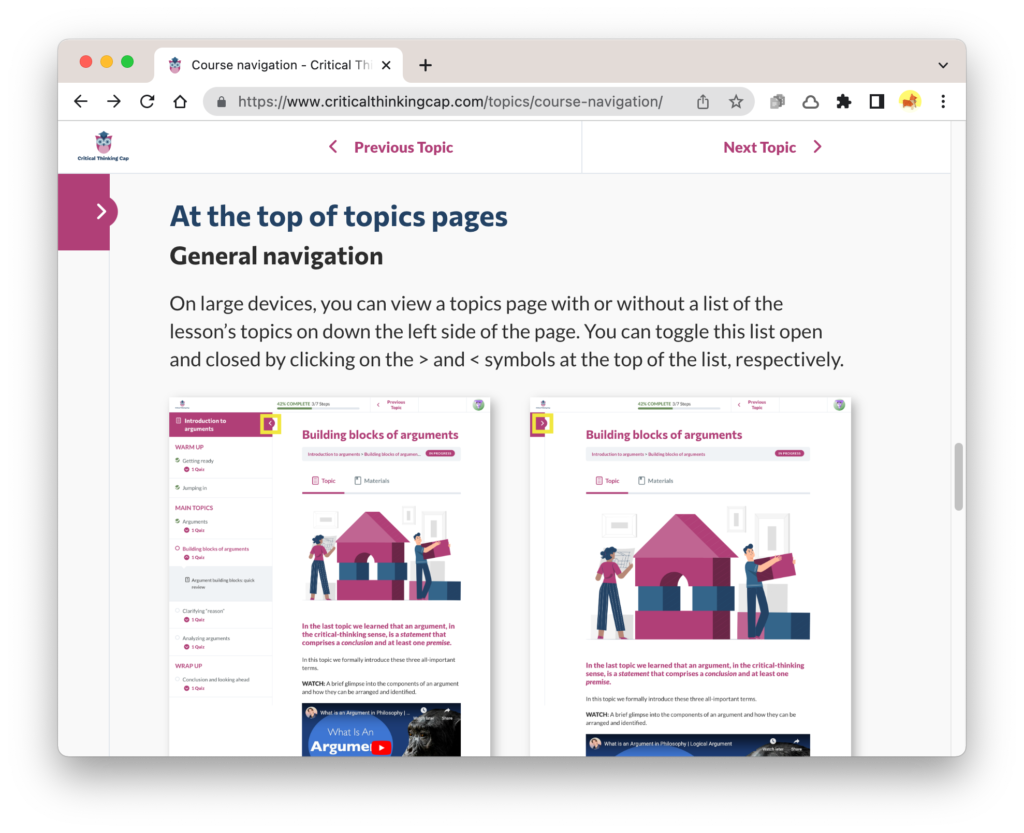
While creating content for the “Course navigation” topic in the “How to take this course” lesson, I took myriad screenshots. When adding these screenshots to the topics pages, I noticed that background color of some topic pages were the very very very light gray intended, while others will still pure white, as shown in the screenshot with two screenshots, below.
And while focusing on background colors, I was reminded that I hated the background colors of the breadcrumb areas, which normally appear under topic headings. Their light-powder-blue color looks even worse against the corrected page-background color.

So, back to Chrome’s developer tools to hunt for appropriate CSS selectors.
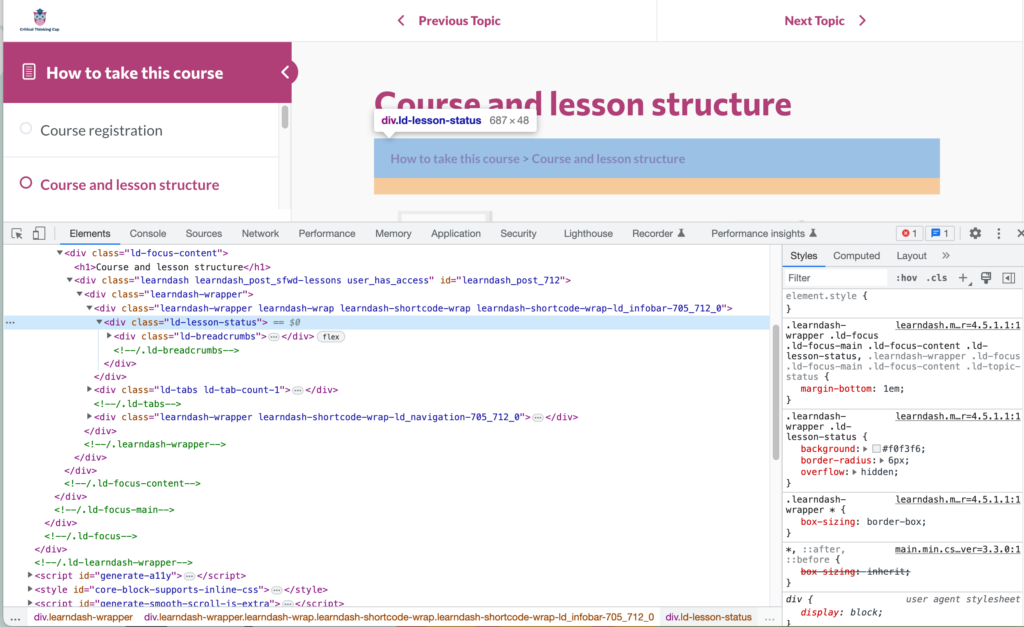
I searched and futzed and tested and . . . yada yada yada . . . came up with some styling I think works well.
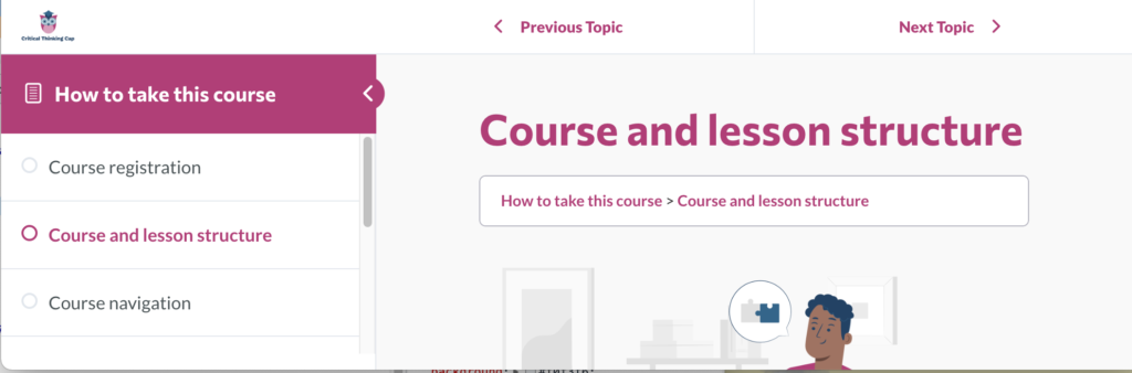
I had already decided to keep the LearnDash top and side navigation pure white; the background colors contrast enough to be noticed by most people, but they’re not so contrasty as to be distracting.