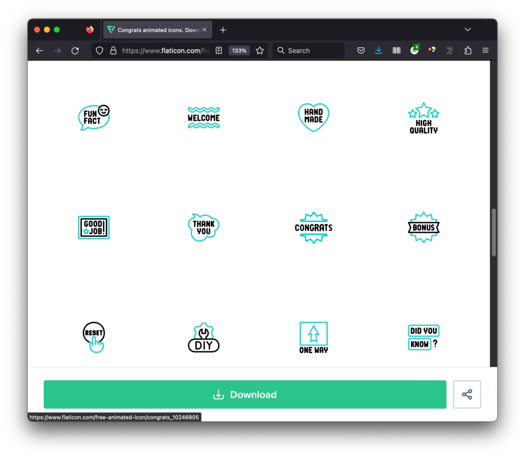
On my punch list for the project is adding animated icons to the quiz response messages, especially if the user actually answered all the questions and/or got most or all of them correct. This is the best I could think of to stand in for any badge-collection feature/activity I had originally wanted to include. At least with the animated icons, there is at least some lightheartedness as well as a little graphic pat on the back for a job well accomplished.
Since time is short I’m opting for the options available through freepick / flaticon. They’re rather basic and come in colors that are not my brand colors, but they’re the most accessible for the moment. There are plenty of websites out there for different types of editable animated images, but the two I’ve come across in the past few hours (iconscout.com and lottiefiles.com) want $180 up front even if all I want is a few images. (Their $15/mo. fee was doable for a test run, until I learned that they bill annually ONLY.)
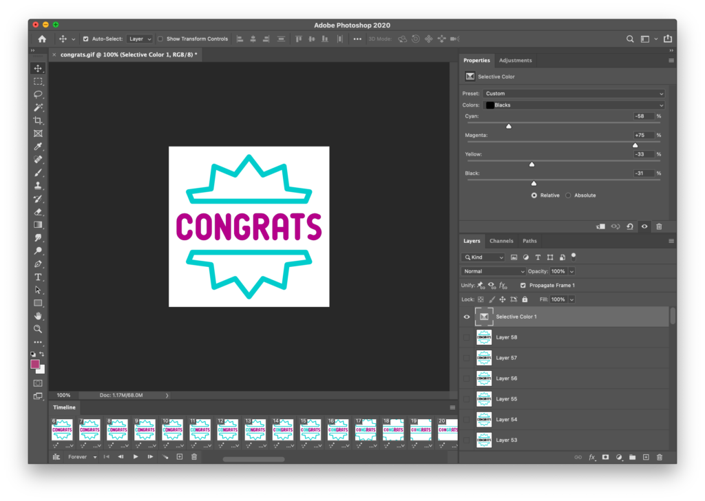
One snag is I had no idea how to edit the colors of an animated gif, so I turned to the Googledom for assitance. There were several routes to try, such as: 1) Downloading an SVG and tapping various websites and apps that help you out for a steep fee, 2) Downloading an AEP file that only Adobe After Effects could open and edit, and 3) Downloading the animated GIF proper and trying to finagle something through Photoshop.
Since the SVG route seemed pricey at the moment, and though I had access to After Effects, I’d never used it before, I opted for the Photoshop method.
In a nutshell, Photoshop loads all the frames/layers when you open the gif. Though you could probably go in and edit each layer (this gif had over 50), one suggested way was to:
- Open the animated GIF
- Create an adjustment layer at the top of all the layers you want affected by your adjustment (which, in this case, is every layer)
- Choose “selective color” as the type of adjustment you want.
- Muck with the color selections. This gif had only the black and the teal colors, so it was rather straightforward, except that the CMYK values for my brand colors didn’t seem to work out well, so I started winging it until I achived colors that sorta resembled my brand colors.
Below, the before and after versions. I’ll rate my color work “close enough.”


OK. Adding the image to the response text:
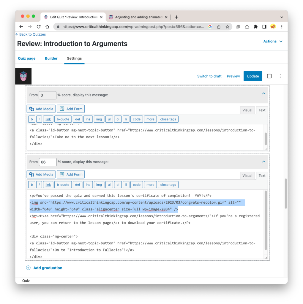
Dang! The background is white; not transparent.
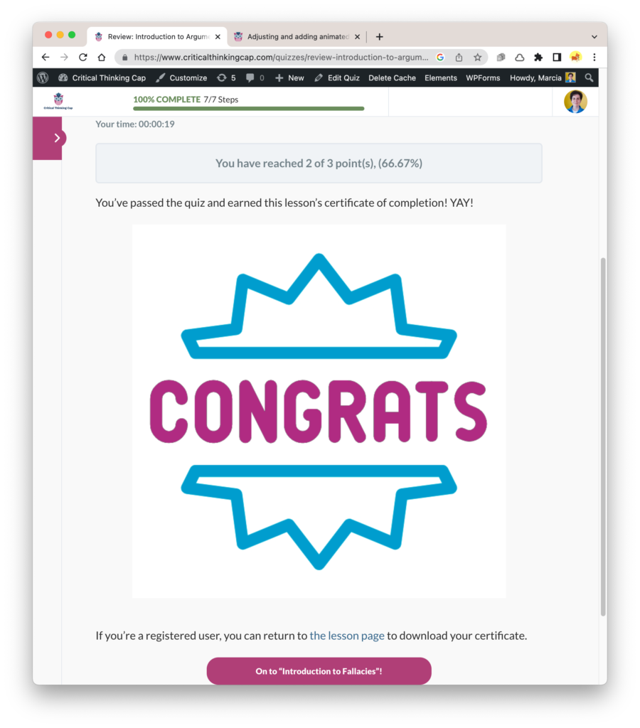
Hm. Probably can’t do anything about the transparency now. Also, it’s really big — as you can tell from the animations above, they can get annoying really fast, especially if they’re too big!
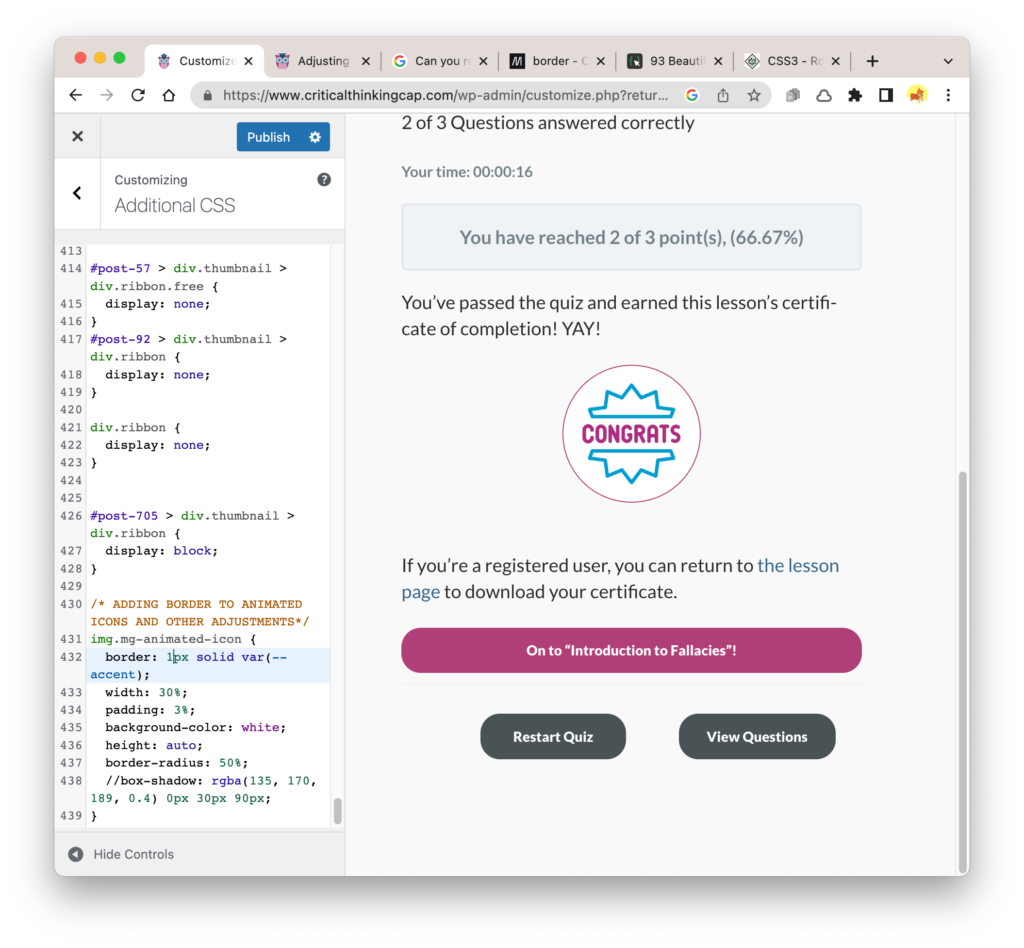
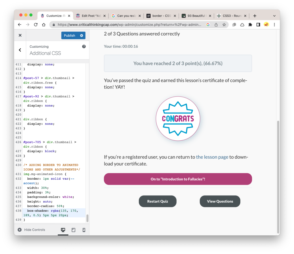
Time to add a class and adjust the CSS. I’ll make the icon considerably smaller and try to make the white background look intentional — ah, maybe like a “real” badge! Results below; just have to decide whether or not it’s better with the drop shadow. I’ll stick with the drop shadow for now.
Alas, now I must do all of this again so I can have different “badges” for different quizzes.