First, the infographic
I had intended to create a simple progressive infographic on the building blocks of arguments for the lesson topic of the same name. Thankfully, the image I was already using as the topic’s main image could easily be edited to become each “step” of the infographic progression:
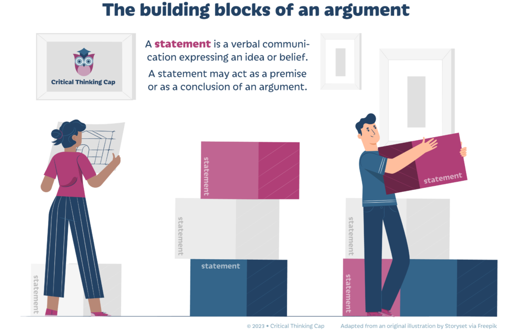
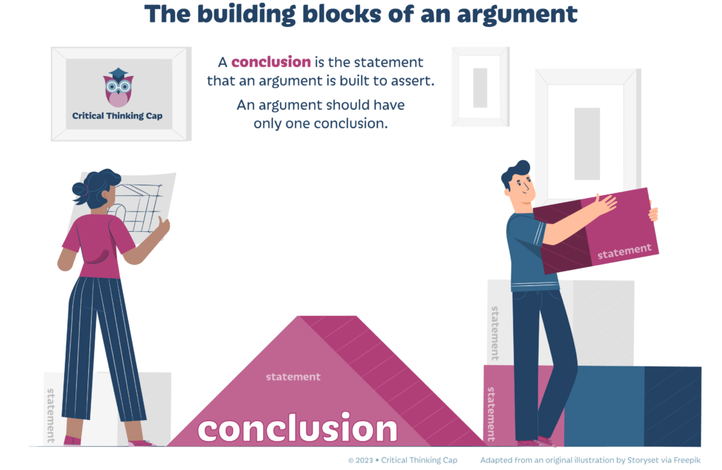
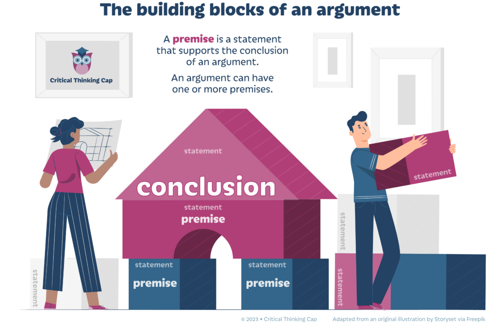

The final version of the progressive infographic will be available for download via the “materials” tab of the topic.
(March 25 update) Grrr . . . just noticed I need to number the sequenced individual infographics so it’s understood they’re part of a series – or change their titles accordingly. OY. Gotta edit each one, reconvert to PNG, upload revised images, and replace the errant images.
Second, the shortcoming of the “materials” tab
In a nutshell, the materials tab had these issues:
- As far as I could tell, you had to edit the content for the materials tab using an older-fashioned text editor. Not a huge problem, but I opted to add and style my own HTML.
- The materials area by default does not readily direct you back to the topic. Yes, you could go back to the “topics” tab, but that’s not going to be evident to all users. So, the options closest to the material tab, or that stood out the most when viewing the tab, was the “Topic Content” area, which only listed the one available quiz, and links to the previous topic or back to the lesson as a whole. Not good.
My solution to the latter of these issues was to add the same type of button I had to add to feedback messages of completed quizzes.
Thirdly, the PDF download icon rabbit hole
Once I created the downloadable infographic and provided the download link in the materials tab, I absolutely positively had to put a PDF icon to the left of the download title.
And I wanted it done NOW.
I found a suitable icon from Flaticon.com which I recolored for branding purposes. But I had forgotten how to do correctly add it to the left of my verbiage via HTML and CSS.
A quick Googling of the subject reminded me about Fontawesome, which is basically a font of icons you apply to your website using <i> or <span> tags then style with CSS. But you have to add some code to the <head> element of the webpage for all that to work and I didn’t want to put in all that effort.
What about Google fonts? Do they have an icon font that I can use as I would other Google fonts via the CSS @font-face rule? Yes, they have an icon font that had similar usage directions as the Fontawesome font, but apparently no @font-face option either.
So, dang it, I discovered and then succumbed to the Fontawesome WordPress plug-in. I added the icon, styled it, tried but failed to add fancy styling that I couldn’t actually use unless I paid $100 for the privilege, then moved on.
The screenshot below shows how I left things. My main concerns moving forward are:
- Is there too much pink on this page?
- The navigation buttons are capsules, that is, long rectangles with rounded edges. But so isn’t the “IN PROGRESS” indicator shown just below the topic title. Is that potentially confusing? Would someone really try to click on that thinking it’s a button? Hm.