Updated February 7, 2023.
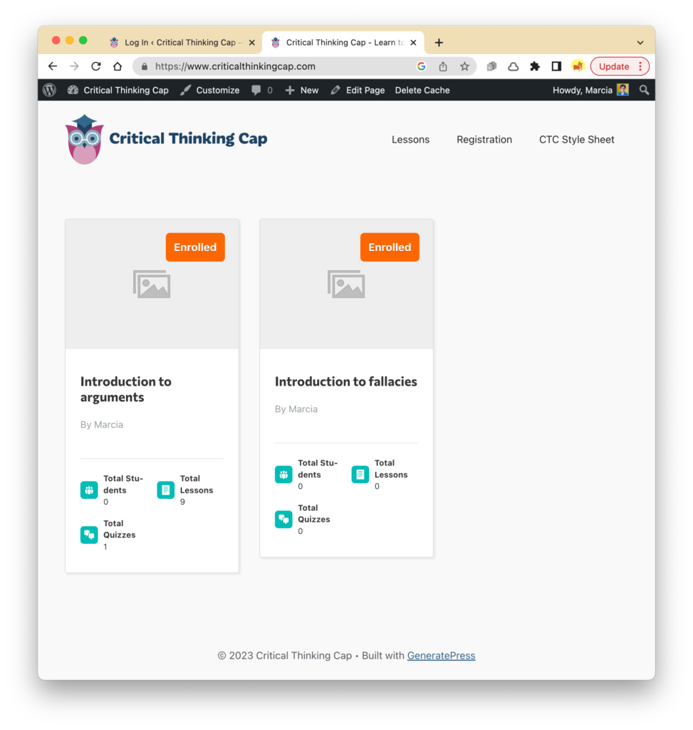
LearnDash has at least two default versions of a course-grid template. The first turned up on my homepage, when I added a “LearnDash Course Grid” block. It takes on none of my styling instructions and it offers user status (eg.,”Enrolled”) as well as some metrics such as “Total Lessons” for each, er, lesson. (“I’ll need to change that; it should be “Total Topics.)”
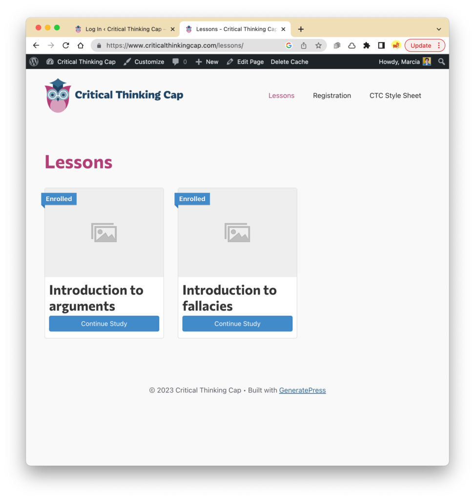
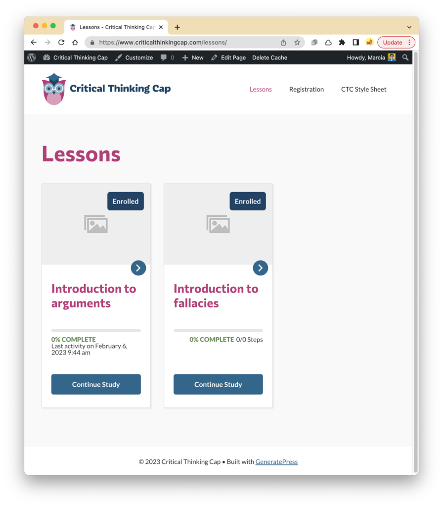
There is another style of course grid that showed up on the Learn-Dash generated “Lessons” page. (Actually, it defaulted as a “Courses” page that I had to change to “Lessons.”):
I have yet to figure out how each set of styles is “pulled in” to the grid, and, more importantly, how I can change colors, formatting, layout, content, verbiage, etc.
I’ll share related discoveries within this post.
Course-grid revelations
First revelation: The styling of the course grid is controlled within the WordPress block editor:
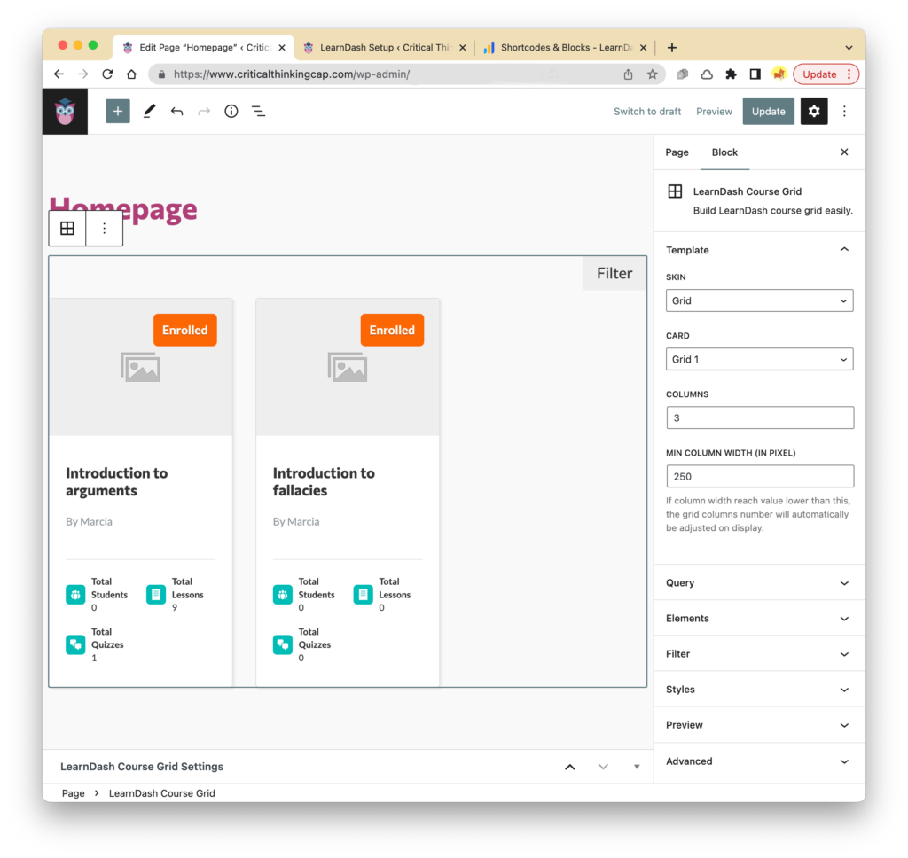
After futzing a bit with settings, the course grid on the homepage looks like this (both ribbons say “enrolled” and both buttons say “continue study” because I’m currently logged in and have accessed both courses already):

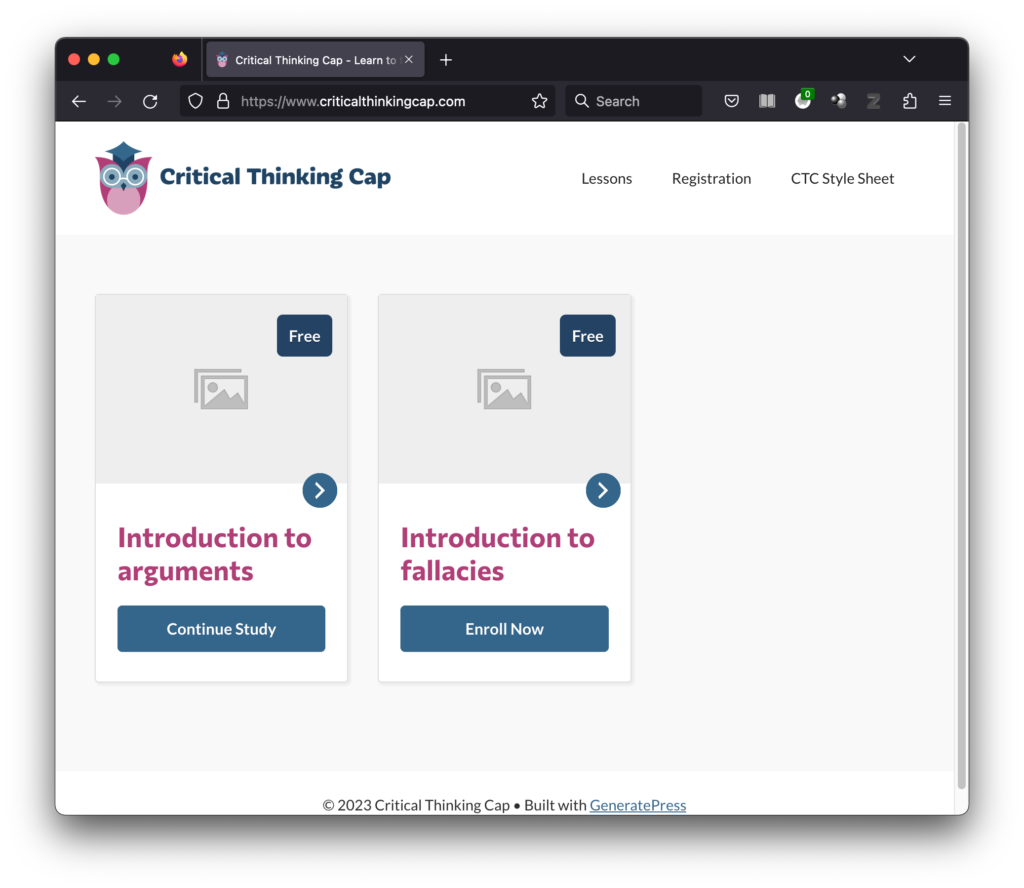
Some of the content within the cards is dynamic, of course. For example, the button text will change depending on whether the user has embarked on a lesson or not:
Second revelation: That course “grid” on the Lessons page was actually a LIST block, not specifically a GRID block. So I changed it to a course-grid block and styled it similarly to the grid on the homepage:
I still want to futz with the fonts/colors/layout of that progress bar, but so far, so good, I think!